

For Those Who Refuse The Ordinary
Brand and landing page for an ultra-luxe sea-facing high-rise above Dona Paula, Goa.
Experience luxury at Oddavell
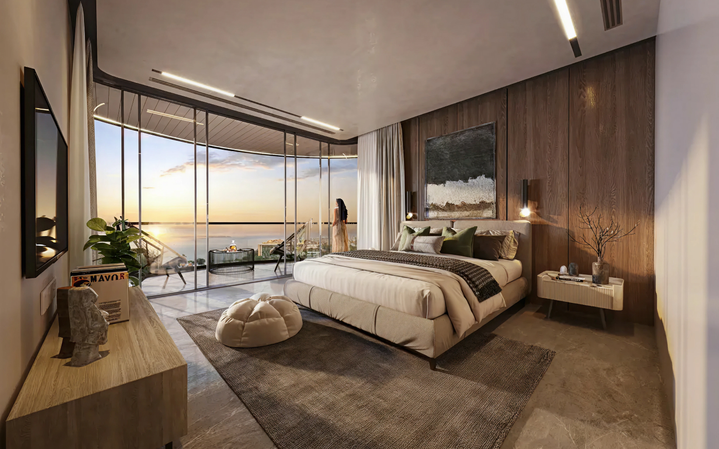
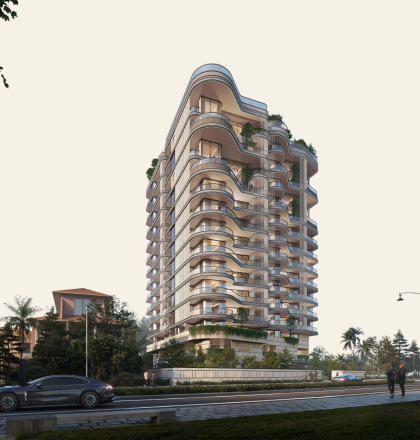
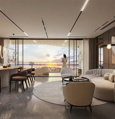
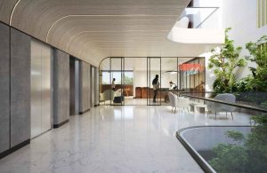
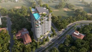
Overlooking Dona Paula’s hillscape, Models Oddavell emerges as Goa’s most distinguished ultra-luxe high-rise, offering uninterrupted panoramas of the Arabian Sea. A curated collection of luxury sea-facing apartments and penthouses, crafted for those who value rare distinction, where elevated coastal living, open horizons and the extraordinary converge.
Kilowott built the brand system and the page: an eleven-colour palette, a two-family type scale, a documented tone of voice, and a 1440px landing page in twelve sections. The system is narrow on purpose — one serif for every headline, one grotesque for everything else, and no colour that does not earn its place.
The problem with selling the extraordinary
Three conditions shaped every decision that followed.
A buyer who does not respond to selling
The audience already knows what it wants. Volume-market property language — urgency, superlatives, discounts — reads as noise to someone choosing a home at this level.
A category that all sounds identical
Prime location. World-class address. Every developer in Goa has the same sentences available, and not one of them describes this building or this hill.
A site whose story is the actual asset
Dona Paula’s hillscape, the legacy of the noblewoman who shaped it, the uninterrupted Arabian Sea. The brand had to be built on place, not on adjectives.
Legacy in every layer, horizon in every view
1 2 3 4 5 6 7 8 9 0
New York
Aa Bb Cc Dd Ee Ff Gg Hh Ii Jj Kk Ll Mm Nn Oo Pp Qq Rr Ss Tt Uu Vv Ww Xx Yy Zz
Specimen note — The Oddavell design is set in New York, an Apple system font. It cannot be licensed or self-hosted as a webfont, so it cannot be served to non-Apple visitors. This specimen renders in Newsreader, the closest available transitional serif, with New York left in the stack for devices that have it locally. The display face is an open decision before build.
Restraint as a strategy
One serif, one grotesque
New York carries every headline; Libre Franklin does everything else. The two scales barely overlap — the serif never runs below 18px, the sans never above 16px — which is what makes the page read as composed rather than busy.
A palette with no cool tone
Nine warm neutrals and a single red, held back for required-field markers. The photography and the interface share one colour family, which is why the page holds together with so little colour of its own.
Depth without shadows
Elevation comes from ground colour, gradient scrims and overlapping images. There is not one drop shadow in 7,838 pixels of page.
Place before adjectives
Every section names Dona Paula, the Arabian Sea or the hill. Nothing claims a number the project cannot stand behind.
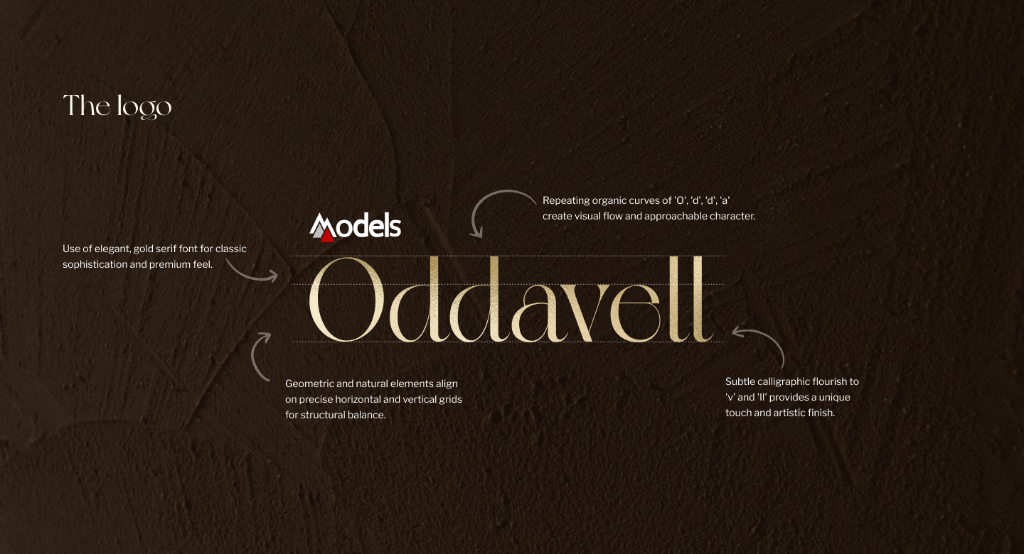
Three grounds, one mark



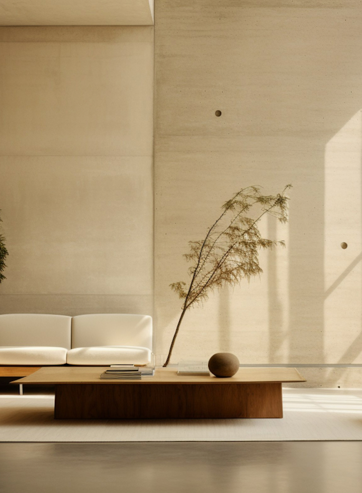
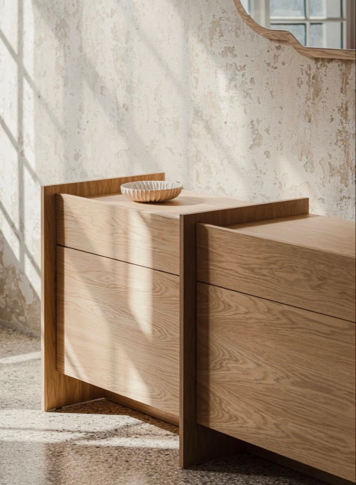
The system, off the screen
The building, drawn flat
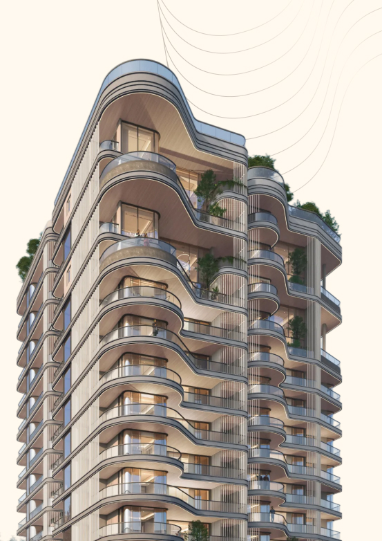
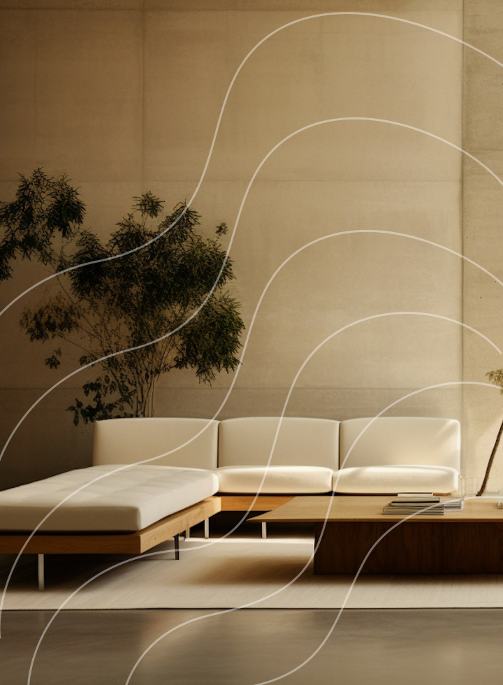
The wave lines serve as a signature pattern for Oddavell, drawn directly from the building’s soft, sculptural architecture. Inspired by its flowing forms and rhythmic curves, this pattern becomes a visual extension of the place itself—subtle, elegant, and unmistakably connected to the design language of Oddavell. It can be used thoughtfully across selected touchpoints to create cohesion, add character, and reinforce the architectural story behind the brand.
Twelve sections, no shadows

Shown clipped — the page runs 1440 × 7,838px.
Hero
A 56px display line over a photograph, lifted by the Halo Ellipse. One headline, one call to action, nothing else.
About
Cream ground, image left, copy right, three uppercase links. The page’s quietest section and its most typographic.
Amenities
Five arch tiles on taupe — 236.8px wide on a 20px gutter, each amenity described in a single sentence.
Contact
Five fields on taupe. White inputs at 4px radius, placeholder in Stone, required markers in Signal Red.
Designed at 1440px. Responsive breakpoints are the next phase — the file contains no mobile or tablet frames.
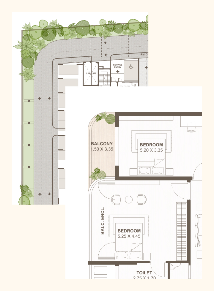
Drawn for the light
The custom floor plans for Oddavell are a testament to innovative design and luxurious living. Each layout has been meticulously crafted to maximize space and enhance the flow of natural light, creating an inviting atmosphere that resonates with elegance. These plans not only reflect the unique architectural vision of the building but also cater to the lifestyle of discerning residents, ensuring that every corner is optimized for comfort and functionality. With thoughtful attention to detail, these bespoke designs harmoniously blend aesthetics with practicality, making them a perfect fit for those who seek the extraordinary.
Launching a project that can’t afford to look like the others?
We design the identity, the system and the page as one piece of work, and document it so your team can build on it without us in the room.
Further reading
- One Idea, Three Scales: Turning a Building Detail Into a Full Brand System
 The Three Escapes That Make Luxury Brands Look More Generic
 The Market Data Behind India’s Luxury Real Estate Boom
 What to Measure on a Luxury Property Site After It Goes Live
 The Case Against Shadows in Luxury Digital Design
 Why Location Should Outrank Amenities on a Luxury Property Page