

If you’ve sat through a competitive review before a premium launch, you already know the feeling. Every deck in the room promises “elevated living,” “curated experiences,” and “uncompromising design.” Every render shows the same aerial shot at golden hour. Every palette leans on the same three or four cues the category has agreed, without ever voting on it, mean luxury. Nobody in the room is lying, exactly — they’re all reaching for the same shelf, because it’s the shelf everyone reaches for.
The instinct, when a brand team notices this, is to reach harder. A stronger adjective. A more dramatic hero shot. One more amenity on the list. None of it works, because none of it changes what’s actually available to copy. If your differentiation lives in vocabulary or in features, a competitor can have it by Thursday.
There’s a sturdier way to solve this, and it doesn’t start with better words. It starts with a question most brand briefs never ask: what does this specific asset have that nothing else in the category has — not a feature, a physical thing — and what happens if you build the entire identity out of that one thing, at every scale, instead of out of category conventions?
We worked through this on a live project: Models Oddavell, an ultra-luxury sea-facing residential tower above Dona Paula, Goa. The case study shows the finished system; the whitepaper sets out the market case for why this matters now. This post is the method underneath both — stated plainly enough that you can run it on a project that has nothing to do with real estate.
One caveat before any of it: the Oddavell site hasn’t launched yet, so nothing here is backed by a conversion number. We’ll come back to that directly in what client approval does and doesn’t prove — it matters enough that it gets its own post rather than a footnote.
Why the usual fixes make sameness worse
Most teams facing a crowded category reach for one of three moves: a stronger adjective, a more familiar luxury signal, or one more feature. All three feel like progress and all three are structurally self-defeating — we walk through exactly why in the three escapes that make brand sameness worse. The short version: each move competes on a dimension every competitor can match at zero cost, so the category homogenizes further with every team that tries to stand out using the category’s own tools.
The way out isn’t a fourth move in the same family. It’s changing what the asset is derived from.
The four principles
1. Find the one feature only your asset has
Not the category’s features — the specific building’s, the specific product’s, the specific site’s. On Oddavell, the designer didn’t reach for a generic coastal motif. Asked where the identity actually came from, the answer was direct:
“Same feature. It mainly comes from the balcony curves.”
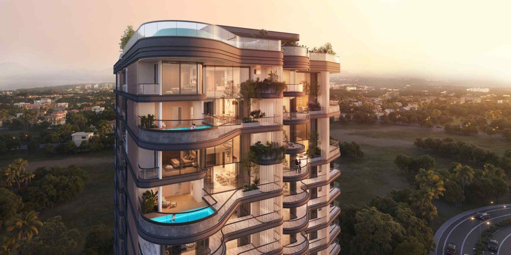
The tower’s balconies have a particular soft, sculptural curve — and that curve, not a category cue, is where the wordmark’s letterforms, the signature wave pattern, and the 1000px arch on every amenity tile all come from. One physical thing, three separate outputs. We go deep on how that discovery actually happens — because “find your unique feature” is easy to say and hard to do — in finding the one feature only your building has.
2. Express it at three scales
A single distinctive shape used once reads as decoration. The same shape used at identity scale (the wordmark), surface scale (a repeating pattern), and interface scale (a component’s actual geometry) reads as intent — because a viewer’s eye catches the repetition even before they can name it. One idea, three scales walks through how the Oddavell curve moves from logo to pattern to UI without ever being explained on the page — it just accumulates.
3. Sequence by scarcity
This is the principle that has nothing to do with visual design and everything to do with what order things appear in. Most property pages lead with amenities — pools, gyms, concierge — which puts the project into a spec comparison it structurally cannot win, because amenities are reproducible by any competitor with a big enough budget. The Oddavell page instead leads with the hill and the address, arriving well before any amenity or floor plan. The designer’s reasoning was blunt:
“Amenities can be found elsewhere but the location is rare.”
Why location should outrank amenities on a luxury property page generalizes this into a rule you can apply to any page that currently opens with a features list: audit what’s actually scarce, and put that first.
4. Subtract the category’s defaults
Every convention you remove is a differentiator you didn’t have to invent — and removals are usually cheaper and more legible than additions. Oddavell made two of these subtractions explicitly. The first: a sea-facing property with no blue anywhere in the palette, reasoned through in why a sea-facing brand left blue out of the palette. The second: not one drop shadow across a 7,838px page, covered in the case against shadows in luxury digital design. Neither subtraction is arbitrary — both are argued from what the category defaults to and why that default was actively working against this particular brand.
Why this actually works
None of this is folk wisdom. It maps cleanly onto the Distinctive Brand Assets research out of the Ehrenberg-Bass Institute (Jenni Romaniuk’s framing, specifically): non-name brand elements — colours, shapes, patterns, sounds — get scored on two axes, fame (how many buyers recognize the link) and uniqueness (how many competitors share it). A gold accent, a serif headline, an aerial hero shot at sunset are all category cues: by definition low-uniqueness, because everyone in the category owns them too. They make a brand legible as luxury and simultaneously invisible as itself.
Principles 1 and 2 raise uniqueness — a competitor would have to copy your actual building to copy your assets, which is a much higher bar than copying your adjectives. Principle 3 moves the argument onto ground where you hold a structural monopoly; nobody else has your address. Principle 4 raises fame indirectly, by making the few assets you keep carry more visual weight instead of competing with borrowed decoration.
The stakes for getting this right aren’t small, either. We put real numbers on the category’s growth — and flag exactly which of those numbers are solid and which need a caveat — in the market data behind India’s luxury real estate boom.
Running the audit on your own project
You don’t need a rebrand to test this. Take an hour with whatever you’re currently building or launching and ask, in order:
- List every brand asset you currently have. For each one, honestly answer: could a competitor use this tomorrow?
- Identify the one physical feature of your actual asset — the building, the product, the site — that nothing else in your market has.
- Pick three scales to express it at: identity, surface, interface (or their equivalents in your category).
- List the category defaults you’ve inherited without deciding to. Delete one.
- Reorder whatever page or deck you’re building by scarcity, not by feature count.
That last step is usually the fastest win and the one teams skip, because reordering feels like it isn’t “real” design work. It is — see why location should outrank amenities on a luxury property page for the case in detail.
What this framework doesn’t claim
We’re stating this method as something argued from a live worked example, not as a results table — because a results table doesn’t exist yet. The Oddavell site hasn’t gone live, so there’s no enquiry data, no traffic, no conversion number to point to. The whole evidentiary base for the project is client sign-off: “the client really liked the design and said it matched her vision.” That’s approval, not performance, and we’ve written a full post on exactly what that distinction should and shouldn’t be allowed to carry — what client approval does and doesn’t prove. If you’re the kind of reader who wants the honest version of a case study rather than the polished one, that’s the post to read next. And once a site like this does go live, there’s a specific, unglamorous list of things worth tracking before the launch excitement fades — covered in what to measure on a luxury property site after it goes live.
The method stands on its own regardless of what those future numbers turn out to say. It’s a way of manufacturing uniqueness that can’t be arbitraged away by the next competitor with a bigger budget and the same stock photo library — and that’s worth having whether or not this particular building ever proves it out in a conversion report.