

Open ten luxury real estate sites in ten tabs and you’ll notice the pattern within about thirty seconds: an aerial hero shot at golden hour, a serif headline promising “elevated living” or “curated experiences,” a gold accent somewhere near a call to action, and a photo of a marble lobby that could belong to any of the ten. None of these sites are badly made. Most of them are executed competently, sometimes beautifully. They’re also nearly interchangeable, and that interchangeability is the actual problem a launch has to solve — not craft, not budget, not photography quality.
The one-feature framework we’ve written about elsewhere is the fix. This post is about the three moves teams reach for instead, because each one feels like differentiation while it’s happening and turns out to be the opposite once you see the pattern across a whole category.
Escape one: adjective inflation
The first instinct when “luxury” stops sounding distinctive is to reach for a stronger word. Elevated becomes ultra-elevated. Curated becomes meticulously curated. Bespoke, iconic, unparalleled — the vocabulary escalates because everyone in the category is running the same experiment at the same time, and for a while a stronger word does feel like it’s working.
It isn’t, because a word is free for a competitor to copy. There’s no cost, no lead time, no asset behind it — just a thesaurus. When every project in a market promises the superlative version of the same claim, the superlative stops carrying information. A buyer comparing five listings that all call themselves “unparalleled” hasn’t been told anything that distinguishes one from another; they’ve just been told, five times, that they’re looking at the luxury category.
Escape two: category-cue borrowing
The second move is subtler and harder to argue against in a design review, because it produces work that genuinely looks like luxury: serif display type, gold as an accent colour, marble textures, aerial photography, and — for anything near water — blue.
These signals aren’t wrong exactly. They’re recognized; a viewer’s eye does read them as “premium” almost instantly, which is exactly why every team in the category reaches for them. But recognizability and ownership are different things. A cue that signals the whole category, by definition, can’t signal one brand inside it. It makes the work legible as luxury and simultaneously invisible as itself — a viewer knows what kind of thing they’re looking at without retaining which specific thing it was.
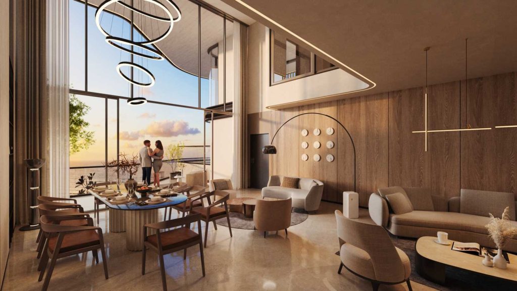
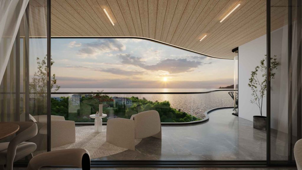
We ran directly into this one on a live project. Models Oddavell is a sea-facing tower — the most obvious move for the palette, the one nearly every coastal developer makes, is blue. The brief we worked from actively rejected it:
“The colours chosen are warm, calming and speak luxury. The ocean colour would create a disconnect with the current colour harmony. So yes, it was a deliberate decision not to use it.”
We go into exactly why removing the “obvious” colour turned out to be the stronger choice, not a riskier one, in why a sea-facing brand left blue out of the palette. The same subtraction logic shows up again around depth and shadow — see the case against shadows in luxury digital design — because category-cue borrowing isn’t only a colour problem. It shows up in texture, in iconography, in layout conventions inherited without anyone deciding to inherit them.
Escape three: feature escalation
The third escape happens once a team notices the copy and the palette both feel generic, and reaches for something that feels concrete instead: add a feature. One more amenity, one more spec line, one more thing the sales sheet can point to that a competitor’s sheet doesn’t have — yet.
This is the escape that feels most like progress, because a new pool or a new concierge service is a real, buildable thing, not just a word choice. It’s also the most self- defeating of the three, for a simple reason: amenities are reproducible by definition. Any competitor with a comparable budget can build the same pool next year. Leading a brand story with features drags the whole comparison onto ground where the only winning move is to keep spending, indefinitely, on things anyone else can also buy.
The alternative isn’t “have fewer amenities.” It’s sequencing what you already have by how scarce it actually is, and leading with whatever sits at the top of that list — usually something nobody can buy their way into, like a location. That’s a large enough idea that it gets its own full treatment as principle three of the framework, worked through with the actual page order from the Oddavell site.
Why this matters more than it looks like it does
None of these three escapes is a rounding error. The category they’re playing out in is large and getting larger — India’s luxury residential segment alone is sized in the tens of billions of dollars and growing at a double-digit rate, with the ₹1 crore-plus segment taking a rapidly increasing share of total sales. We put real figures on that, and flag exactly which ones need a caveat before you cite them, in the market data behind India’s luxury real estate boom. A crowded category that’s also a growing category means more entrants running the same three escapes at the same time, which compounds the sameness problem rather than solving it through sheer volume.
The way out isn’t a fourth escape from the same family — a slightly stronger adjective, a slightly more premium cue, one more amenity than the last competitor. It’s changing what the identity is built from in the first place, which is the subject of the one-feature framework: find the thing that’s actually yours, and build outward from it instead of inward from the category.