

Why every luxury property brand looks the same — and how to build one that can’t be copied
A method for deriving brand assets from the physical asset you are actually selling.
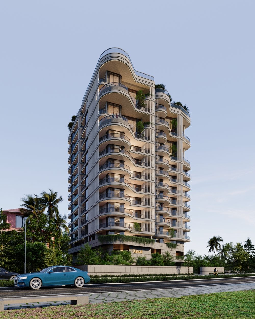
Premium residential projects are converging on a single look. The same serif, the same gold, the same aerial drone shot, the same promise of elevated living — produced faster than ever by template platforms and generative tools. The result is a category where every project is legible as luxury and none is memorable as itself.
This paper argues that the escape is not a better adjective or a more expensive template. It is a method: derive your brand assets from the physical asset you are actually selling. A feature of the building itself is, by construction, something no competitor can use — which is precisely what the distinctive-assets literature says a brand asset needs to be.
We set out the market conditions that produce the sameness, three common escapes and why each fails, a four-principle method, and a worked example: the identity and landing page for Models Oddavell, an ultra-luxury residence above Dona Paula, Goa, where a single architectural feature generates the wordmark, the pattern and the interface.
The worked example is a demonstration of method. The project has since launched and first-period data exists, but it has no pre-launch baseline to be compared against, so this paper makes no outcome claims — see A note on evidence before the case section.
A sea of sameness
Walk through the marketing for ten premium residential launches and you will meet the same document ten times. A high-contrast serif. Gold on dark. A drone shot at golden hour. A grid of amenity icons. And a sentence — nearly always the same sentence — about redefining luxury living.
This is not a failure of taste. It is a structural outcome. The web-design literature for the category names it plainly: real estate sites are stuck in “a sea of sameness: generic templates, stock photos, and a bland, corporate feel,” and for a luxury brand specifically that is “a death sentence” (WP Residence). Template platforms produce a professional-looking site quickly; they also produce the same professional-looking site, because that is what a template is for. Generative tools have compressed the timeline further, and with it the distance between your launch and everyone else’s.
The cost is specific to this category. A buyer at this level is not choosing between your project and nothing. They are running a comparison across a shortlist, often over months, frequently from another country. Sameness does not make you look bad — it makes you hard to retrieve. When the shortlist is reviewed a fortnight later, the project that cannot be pictured is the project that drops off it.
And the shortlist is getting longer. In India, the segment where this matters is where the market is moving.
India luxury residential market, 2026, growing at a 10.95% CAGR (Mordor Intelligence)
Share of housing sales from homes above ₹1 crore in 2025, up from just over 50% in 2024 (JLL data, as reported)
The practical consequence is the one that matters to a marketing team: more capital is chasing the premium buyer, so more projects are competing on the same visual territory, and the territory is not getting bigger.
Market-size projections vary substantially between research firms; we cite one and name it rather than blending several. The JLL share figures reach us via a secondary source and should be verified against the primary release before being quoted onward.
Three escapes that make it worse
Most teams recognise the problem. The three most common responses all fail, and two of them actively deepen the sameness.
Adjective inflation
If luxury is crowded, reach for ultra-luxury. If curated is tired, try bespoke. This competes on a dimension where the barrier to entry is zero: your competitor can adopt your adjective this afternoon, at no cost, and will. Language escalation is the fastest-commoditised move available.
Category-cue borrowing
Reach instead for the visual signals that read as luxury: the high-contrast serif, gold, marble, the aerial — and, for anything coastal, blue. These work. That is the trouble. They are effective at communicating category and useless at communicating brand, because every competitor is using them for the same reason.
The distinctive-assets research makes this precise. Jenni Romaniuk and the Ehrenberg-Bass Institute score brand assets on two axes — fame (what share of category buyers link the asset to your brand) and uniqueness (how exclusively you own it against competitors) (Ehrenberg-Bass). Plot the results and you get four quadrants, and category cues land in the same one every time.
Every category cue you adopt is an asset in the Avoid quadrant. It buys you legibility and costs you attribution. A brand built entirely from them is, by definition, unattributable — which is a fair technical description of the sameness problem.
Feature escalation
The third response is to out-specify: add the sky lounge, the infinity pool, the concierge tier. Amenities are reproducible almost by definition — anyone with the same budget can build the same list — so this drags the project into a spec comparison, on a dimension where the answer changes every time a competitor breaks ground.
Derive the assets from the asset
The quadrant above points at the way out. To move an asset rightward — toward uniqueness — you need a source of uniqueness your competitors structurally cannot access. Most brands do not have one. A building does.
A specific structure has features nothing else in the market has: a curve, a section, a material, a relationship to its site. If your brand assets are derived from those features, a competitor cannot adopt them without copying the building. That is not a stylistic preference; it is the only reliable manufacturing process for uniqueness available to a property brand.
The category’s own commentary is already circling this. Analyses of luxury property web design point to bespoke typography as the strongest differentiator precisely because it “ensures a unique visual identity that competitors cannot replicate” (DMR Media), and to stock imagery as a credibility problem for the same reason in reverse (AMW Group). Both are instances of one principle. Here it is stated generally.
Find the one feature only your asset has
Not a category feature. Not “sea views” — every coastal project has those. A physical characteristic specific to this structure or this site: the profile of the balconies, the rhythm of the fenestration, the way the plan turns to follow a contour, a material chosen for a local reason.
One is enough, and one is better than three. The test: could a competitor honestly claim it? If yes, keep looking.
Express it at three scales
Take the feature and restate it at three different sizes: in the identity (the letterforms of the wordmark), on the surface (a pattern or texture), and in the interface (the shape of a component — a tile, a card, a button).
The number matters. One expression reads as a coincidence. Three unrelated ideas read as decoration. The same idea at three scales reads as intent, and intent is what a buyer perceives as quality even when they cannot name what they are looking at. It also compounds: each expression makes the others more retrievable, which is the fame axis doing its work.
Sequence by scarcity
Order the page — and the pitch — by how hard each thing is to replicate, not by how impressive it sounds. If the amenities are reproducible and the address is not, the address goes first and the amenities go later.
This inverts the standard project page, which usually opens with the feature grid. The reasoning is simple: leading with reproducible things puts you in a comparison you can only draw. Leading with the irreplaceable thing puts you in a comparison you cannot lose, because there is no substitute for it on the shortlist.
Subtract the category’s defaults
List the conventions you have inherited without deciding on them — the drop shadows, the blue, the stock aerial, the icon grid — and remove one deliberately. Every default you delete is a differentiator you did not have to invent, and subtraction is cheaper and more legible than addition.
Removal also has a second-order effect: with fewer assets carrying the identity, the ones that remain are seen more often and get more attributional weight. Fewer assets, better known, is the shape of a strong distinctive-asset portfolio.
Find the one feature only your building has, express it at three scales, lead with whatever is scarcest, and delete a category default. Principles 1 and 2 buy uniqueness; principle 3 moves the argument onto ground you own outright; principle 4 concentrates fame on fewer assets.
A worked example: Models Oddavell
Models Oddavell is a sea-facing residential high-rise above Dona Paula, Goa, by Models Leisure Ventures Pvt. Ltd. Kilowott designed the identity, the brand system, the floor plans and the landing page. The project is a useful example here for one reason: the derivation is unusually clean, and it is visible in the artefacts without needing to be explained.
What follows is a demonstration of method, shown in the artefacts themselves. Models Oddavell launched after this work was delivered, and first-period search and analytics data now exists. It is deliberately not cited as proof here: the page was measured only after launch, so there is no baseline to compare against, and nothing in the data attributes a result to any single design decision. No user testing has been conducted.
The only project-side evidence is the client’s response to the work — in the designer’s words, “the client really liked the design and said it matched her vision.” That is approval, not performance, and it is presented here as nothing more. No claim in this section asserts that any decision increased, improved or drove anything.
The one feature
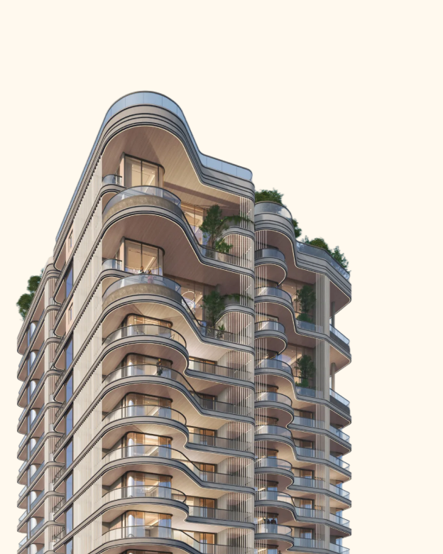
“Same feature. It mainly comes from the balcony curves.”Designer, Models Oddavell — on the origin of the wordmark, the pattern and the tile shape
Three scales
The curve in Fig. 1, expressed at three scales


This is what principle 2 looks like when it is done properly. A reader scrolling the page does not consciously register that the tile shape and the letterform and the background pattern share a source. They register coherence, and they attribute it to care. The asset is also, in the technical sense, unavailable to competitors: to use this curve you would have to build this building.
Sequence by scarcity
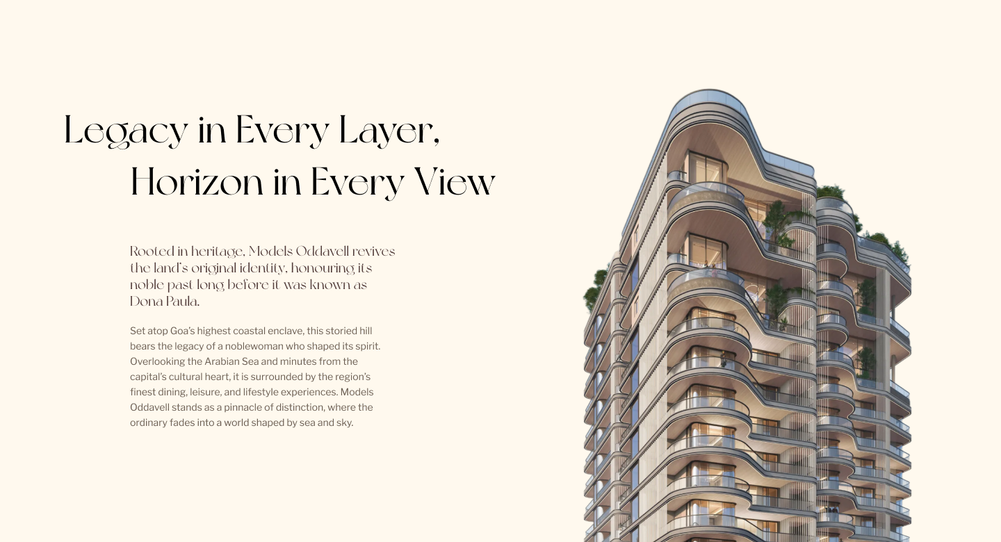
The reasoning was explicit, and it is the clearest statement of principle 3 in the whole project:
“Amenities can be found elsewhere but the location is rare.”Designer, Models Oddavell — on why the heritage section leads
Dona Paula is among the most sought-after addresses in Goa. A pool is not. Putting the pool first would have entered the project into a comparison decided by whoever built most recently; putting the hill first enters it into one with no substitute.
Two deliberate subtractions
The first: no blue. The entire proposition is the Arabian Sea, and the palette contains no cool tone at all — taupe, cream, ivory, gold, and a single red reserved for required-field markers. For a coastal property this is a conscious refusal of the most obvious category cue available:
“The colours chosen are warm, calming and speak luxury. The ocean colour would create a disconnect with the current colour harmony. So yes, it was a deliberate decision not to use it.”Designer, Models Oddavell — on excluding blue
The logic is worth extracting, because it generalises. The sea is already present in every photograph on the page. Restating it in the interface would be redundant and would fight the warm interiors and sunset renders that make up the imagery. The palette does a different job from the pictures, so the two together cover more ground than either would alone.
The second: no shadows. There is not one drop shadow across 7,838 pixels of page. Not on cards, buttons, inputs or dropdowns. Depth is built from three other things: the ground colour changing between sections, black gradient scrims over photography, and images physically overlapping one another.
“It was a conscious decision. Doing so made the website less generic and more classy.”Designer, Models Oddavell — on removing all shadows
The drop shadow is the default grammar of templated web design, which is exactly why its absence is legible even to someone who could not name what changed. Removing it also forces a discipline: with no elevation available, every separation has to be earned with colour, scale or overlap, which is what gives the page its editorial, print-derived character.

| Principle | Applied | Evidence status |
|---|---|---|
| 1 — One feature | Balcony curves identified as the single source | Visible in the artefacts; designer-confirmed |
| 2 — Three scales | Wordmark letterforms, wave pattern, 1000px arch tile | Visible in the artefacts; designer-confirmed |
| 3 — Sequence by scarcity | Heritage and location ahead of all amenities | Visible in page order; designer-confirmed |
| 4 — Subtract defaults | No blue in a sea-facing palette; no shadows anywhere | Visible in the artefacts; designer-confirmed |
| Commercial outcome | Measured after launch, but with no pre-launch baseline — not attributable. | |
An audit you can run this week
None of this requires a new agency, a rebrand or a budget cycle. It requires deciding where your uniqueness is actually coming from. Five steps, in order.
- Inventory your assets.List every element carrying your identity — colours, type, shapes, patterns, imagery style, motifs. Be exhaustive and unflattering.
- Score each on one question.Could a direct competitor adopt this tomorrow at no cost? Everything that scores yes is a category cue sitting in the Avoid quadrant. Most portfolios are mostly yes.
- Find your one feature.Go to the building, the drawings or the site. Identify the single physical characteristic nothing else in your market has. Not a benefit — a feature you can photograph.
- Pick three scales.Decide how that feature will appear in the identity, on a surface and in a component. Draw all three before committing to any one.
- Delete one default, and reorder by scarcity.Remove one inherited convention on purpose. Then re-sequence your page so the least replicable thing you own arrives first.
Steps 3 and 4 are the ones that create an asset. Steps 2 and 5 are the ones that stop you spending money defending assets you never owned.
Who wrote this
Kilowott is a design and technology studio. For Models Oddavell we designed the identity, the brand system, the floor plans and the landing page, and produced the brand documentation the project is built from.
If you are launching a premium project and the competitive set is starting to look interchangeable, the useful first conversation is not about a website. It is about which feature of your building nobody else can use — and whether your current identity is derived from it or from the category.
This paper draws on published market research, cited throughout, and on a documented design-decision interview conducted with the project’s designer. Where evidence does not exist, the paper says so rather than inferring it.
References
- WP Residence — How to build a luxury real estate website without looking cheap. wpresidence.net
- DMR Media — 7 luxury real estate website design trends dominating 2026. dmrmedia.org
- AMW Group — Luxury real estate branding for high-net-worth buyers. amworldgroup.com
- Ehrenberg-Bass Institute for Marketing Science — Brands of Distinction; distinctive brand assets scored on fame and uniqueness. marketingscience.info
- The Brand Algorithm — Distinctive Asset Grid explained; the four quadrants. the-brand-algorithm.com
- Jenni Romaniuk, Research Professor, Ehrenberg-Bass Institute, University of South Australia; author, Building Distinctive Brand Assets. jenniromaniuk.com
- Mordor Intelligence — India luxury residential real estate market; USD 64.21bn (2026), 10.95% CAGR. mordorintelligence.com
- JLL housing-share data (₹1 crore and above: just over 50% of sales in 2024, ~63% in 2025), as reported by Sobha. Secondary source — verify against the primary JLL release before quoting onward. sobha.com
- Project reasoning and designer quotations: Kilowott design-decision interview, Models Oddavell, 2026. Internal record.
Market-size projections for this sector vary substantially between research firms. One source is cited and named rather than several blended. No figure in this paper describes the commercial performance of Models Oddavell. First-period data exists, but with no pre-launch baseline it cannot support an attributable outcome claim, so it is reported separately rather than here.