

Most design case studies quietly do something worth noticing once you know to look for it: they present client sign-off and business performance as the same kind of evidence. “The client loved the redesign” sits in the same paragraph as “conversions rose 30%,” and the reader’s eye slides across both as if they’re proving the same thing. They aren’t. One is a statement about how a decision-maker felt reviewing the work. The other is a measurement of what happened after real people used it. A case study that blurs the two is borrowing the credibility of the second to cover for the absence of the first.
We want to be specific about which one we actually have for the work behind this cluster, because the honest answer changes what every other post here is allowed to claim.
What we actually have
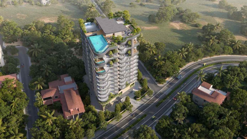
Models Oddavell — the ultra-luxury sea-facing tower whose brand and landing page this whole series draws on — has not launched. As of the interview that grounds this cluster, there is no live site, no traffic figure, no enquiry count, no conversion number, and no user testing of any kind. The entire evidence base for every design decision described across this cluster is a single line:
“The client really liked the design and said it matched her vision.”
That’s real. It’s also, precisely, sign-off — not performance. Client approval tells you that a decision-maker, evaluating the work against their own taste, expectations, and sense of the brand, found it convincing. It doesn’t tell you that a stranger arriving from a search result, comparing five competing projects on a phone screen, will find it equally convincing. Those are different audiences making different kinds of judgments, and only one of them has actually been tested.
Why this distinction gets blurred so often
It’s not usually dishonesty. It’s a structural incentive: a finished project needs a case study before it has performance data, because the case study is often part of getting the next project, and waiting eighteen months for a clean conversion story isn’t commercially realistic. So the case study gets written from what’s available — the reasoning behind the decisions, and the client’s reaction to them — and the language quietly slides toward claims the evidence doesn’t support. “Increased,” “improved,” “drove” are result words. Applying them to a project with no baseline and no post-launch measurement isn’t lying exactly, but it’s writing a check the evidence can’t cash.
We’re not doing that here. Nothing in this cluster claims the balcony-curve identity “increased brand recall,” or that leading with location instead of amenities “improved engagement,” or that the warm palette “performed better” than a blue one would have — not because we don’t believe those things might turn out to be true, but because we don’t have a number, and inventing the appearance of one is worse than admitting the gap. Even the case study’s own stats row makes this distinction explicitly: the figures shown there are design-system counts — colour tokens, type roles, catalogued components, total page height — not business results, because business results don’t exist yet for a page that hasn’t gone live.
What client approval is still worth
None of this means sign-off is worthless as evidence — it’s just a narrower kind of evidence than a metric, and it’s worth being precise about what it does establish. It tells you the reasoning behind a decision was legible enough, and specific enough, to survive a real client’s scrutiny rather than getting revised or rejected. On this project, no design decision was pushed back on or revised after review, as far as was reported — which is a meaningfully different signal than a client who accepted a compromise reluctantly. It also tells you the work matches the client’s own internal sense of the brand, which matters practically: a beautifully performing site that the client doesn’t recognize as their own brand is a real failure mode, even if the traffic numbers look good.
What it can’t tell you is how the market will respond, because the market hasn’t seen it yet. The one-feature framework this cluster is built around is argued from the strength of its underlying logic — reasoning we lay out in detail across the framework posts, including how the balcony-curve feature was actually found — and from published market data about the category it’s competing in. It is not, and doesn’t claim to be, argued from a conversion report, because that report doesn’t exist.
What would close the gap
The honest fix isn’t better copywriting — it’s measurement, once there’s something to measure. If the site launches, there’s a specific list of things worth tracking from day one, rather than reconstructed after the fact from whatever analytics happened to be switched on: enquiry conversion by traffic source, scroll depth and time spent by section, and whether the sequencing argument in why location should outrank amenities actually holds up against real visitor behaviour rather than just design reasoning. We’ve laid that plan out in full — explicitly as a roadmap, not a result — in what to measure on a luxury property site after it goes live. Until those numbers exist, every claim in this cluster stays exactly where the evidence puts it: a well-reasoned method, demonstrated in a real, client-approved artefact, with the performance chapter still unwritten.