

A sea-facing property with no blue in its brand palette sounds, on paper, like a mistake — or at least like a missed opportunity to reinforce the pitch. The entire proposition of a project like Models Oddavell is the Arabian Sea: uninterrupted panoramas, a hillscape looking out over open water, a view that’s the actual reason a buyer is paying attention. Blue is the colour of that view. Leaving it out of the palette looks, from a distance, like leaving money on the table.
It’s the opposite, and the reasoning behind it is worth walking through in full, because it’s a specific instance of the fourth principle in the one-feature framework: subtract the category’s defaults. Blue for a coastal property isn’t a creative choice at all in most of the category — it’s the default, reached for automatically, on nearly every competing site. That’s exactly the problem.
The reasoning, from the people who made the call
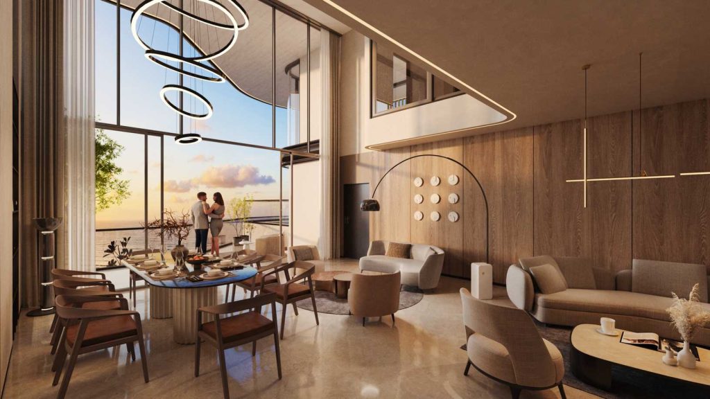
Oddavell’s palette runs entirely warm — a deep taupe, cream, ivory, a gold accent, and a red held back purely for required-field markers on the contact form. There is no cool tone anywhere in the system. Asked directly about the decision, the designer didn’t frame it as an oversight or a budget constraint. It was deliberate:
“The colours chosen are warm, calming and speak luxury. The ocean colour would create a disconnect with the current colour harmony. So yes, it was a deliberate decision not to use it.”
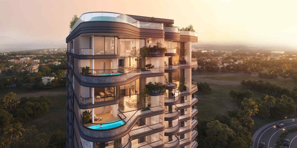
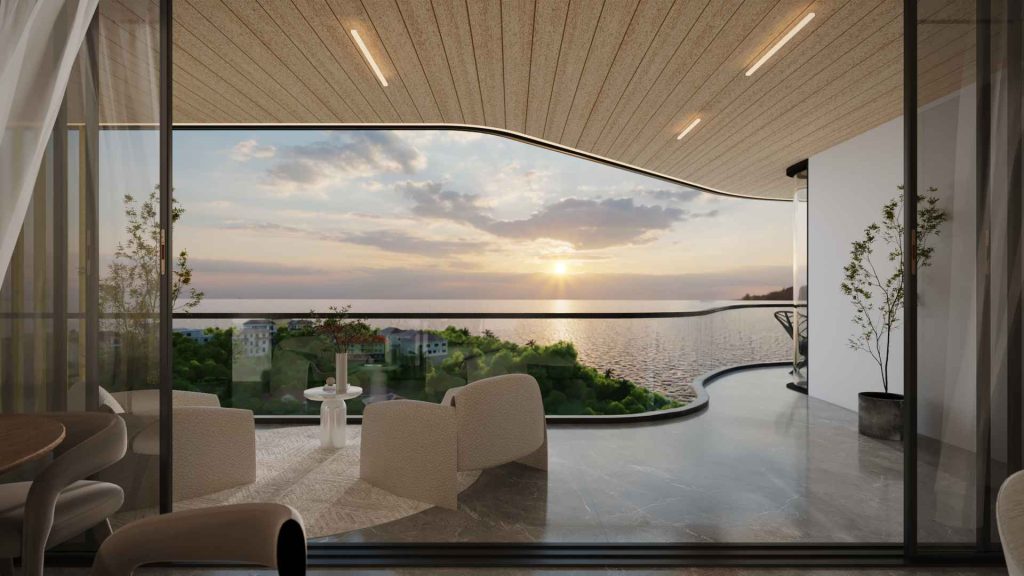
The key phrase there is “disconnect with the current colour harmony.” The palette isn’t warm by accident — the interiors, the sunset renders, the warm-toned photography that makes up most of the project’s imagery were already warm before the palette was finalized. Introducing blue into the interface wouldn’t have reinforced the sea; it would have fought the imagery the site is actually built around.
The sea is already in the photograph — the palette doesn’t need to repeat it
This is the part of the reasoning that generalizes past this one project: when the thing you’re selling is already visually present in your imagery, the interface around that imagery doesn’t need to restate it. A photo of the ocean is the ocean. A blue accent colour next to that photo isn’t adding information — it’s adding a second, weaker version of information the photograph already delivered more convincingly. At best it’s redundant. At worst, if the blue doesn’t precisely match the blue in the photography (and it rarely does, because photography blue shifts with light, weather, and time of day), it actively clashes with the one asset doing the real persuasive work.
Holding the palette in one warm family instead keeps the photography and the interface in the same register. Nothing in the UI competes with the imagery for attention, which is part of why the finished page reads as composed rather than busy — there’s very little colour doing work outside the photographs themselves.
Why this is also a differentiation move, not just a harmony one
There’s a second, more strategic layer to the same decision. Blue-for-coastal is close to universal in the property category — it’s the single most predictable colour choice a sea-facing brand can make, which means it’s also one of the lowest-uniqueness choices available, in the terms we laid out when covering why luxury brands look the same: a cue every competitor in the same geography shares by default contributes almost nothing to how distinctive the finished brand feels. Removing it doesn’t just avoid a clash with the photography — it removes one more shared signal from a category that already has too many of them.
This subtraction pairs with a second one covered separately: the complete absence of drop shadows across the same 7,838-pixel page, argued through in the case against shadows in luxury digital design. Both decisions follow the same logic — a category default gets removed not because it’s ugly, but because keeping it would have cost the brand something it couldn’t afford to spend: a colour family that fights its own photography, or a visual grammar borrowed from templated, mass-market design.
What to check before you make the same call
This isn’t a blanket argument against expected colours in every category — sometimes a category cue is expected because buyers genuinely rely on it to parse what they’re looking at quickly, and removing it costs more clarity than it buys in distinctiveness. The specific test that applied here: does the obvious colour choice compete with or reinforce the imagery that’s actually doing the selling? On Oddavell, the sea was already fully present in every hero shot and render. The palette’s job was to support that photography, not repeat it — and a warm, cohesive palette did that more effectively than the “obvious” blue ever would have. The same discipline that produced this colour decision shows up again in how the shape of the brand’s balcony curve carries across the wordmark, the pattern, and the interface — see one idea, three scales for how that repetition works once the category defaults are cleared out of the way.