

Whitepaper · Specialty retail & digital commerce
The Counter Problem
What an expertise-led shop loses when it goes online — and how to design it back in.
Abstract
In a shop that sells expertise, a member of staff is quietly doing eight jobs at once: answering questions, recommending, upselling, reassuring on safety, taking the standing order, honouring the gift card, directing people to the right branch, and setting the tone of the room. When that shop goes online, the platform replaces exactly one of them — the transaction.
This is why so many specialty retailers end up with a webshop that technically works and commercially disappoints. The store isn't broken; it's incomplete. This paper sets out a practical method — inventory what the human was doing, then rebuild each job as an interface — and shows it applied to a 1994 Oslo delicatessen whose website, until recently, was a form and a telephone call.
Part one
The shop that was still a phone call
Consider a specialty food shop with a real reputation, several branches, and a catalogue of things that are difficult to source. It has a website. On that website is a form. A customer fills in the form describing what they would like. Some hours later an employee reads the form, telephones the customer back, takes the order verbally, arranges payment offline, and ships the groceries.
That was the operating model of the shop in Part 4 of this paper, and it was still the operating model in 2025. The catalogue, in the words of the designer who replaced it, was "products listed like a word document."
It is tempting to treat that as an outlier. It isn't. The categories where human expertise matters most are precisely the categories that digitise slowest, and there is data to say so. In Norway, online grocery accounted for only 5–10% of the category in 2025, against 10–15% for e-commerce overall[3] — a gap that exists because strong, trusted physical retail reduces the pressure to move online[4]. Where the shop assistant is the product, the shop assistant stays.
Meanwhile the cost of not moving is measurable. Order processing handled by phone, email or form runs at $30–80 per order in labour, error correction and cycle time, against $1–5 for an order that arrives through an integrated system[5]. Manual entry carries error rates of 8–15% in typical environments — wrong item, wrong quantity, wrong price — and customer-facing teams routinely spend 40–60% of their working time on order administration rather than on selling[5][6].
These are market figures, not this project's results. They establish that the problem is expensive and common. What they do not tell you is the harder thing: what actually has to be built to escape it.
Part two
Why “just build a webshop” underdelivers
The obvious response to the shop above is to buy a platform. WooCommerce, Shopify, whatever fits — get a catalogue in, wire up payments, switch on shipping. This is correct, necessary, and roughly a third of the work.
The reason it disappoints is a category error. Teams treat digitisation as a transaction problem when it is a knowledge-transfer problem. A platform gives you a cart, a payment gateway and a shipping table. It does not give you the person who used to stand behind the counter — and in an expertise-led shop, that person was carrying most of the commercial load.
Here is what they were actually doing, none of which appears in a platform migration scope:
- Answering questions. They were the product information layer — and they knew which questions actually recur, which is rarely what the catalogue thinks is important.
- Recommending. "You'll want bread with that." The unprompted, contextual upsell that no category page performs.
- Taking the standing order. "Same again next month?" Replenishment, handled by memory.
- Honouring the gift card. The one you sold them over the counter, redeemable because it is the same shop and the same till.
- Directing people. Which branch has it, and when is that branch open.
- Pointing out today's offer. Selectively — not every item at once.
- Reassuring on safety. The allergy question, answered by someone accountable.
- Setting the tone. The lighting, the counter, the restraint. Positioning performed as atmosphere.
These jobs are invisible in a requirements document for the same reason they were cheap to run: nobody ever wrote them down. They were never a feature. They were a person. And when the person is removed from the transaction, each job either gets rebuilt deliberately or it silently stops happening.
A store missing four of these eight still passes user acceptance testing. It just converts worse than the shop it replaced, for reasons nobody can point at.
Part three
The method: inventory the counter, then rebuild it
The method is unglamorous and it works. Before writing a single requirement, list what the humans were doing. Then, for each item, name the interface that will carry that job instead. If you cannot name one, you have found a gap that will show up later as underperformance.
| What the person did | What has to replace it |
|---|---|
| Answered product questions | Depth on the product page — weighted by which question actually recurs |
| Recommended what goes with it | Merchandising attached to intent, not to the catalogue |
| Took the standing order | Subscription or replenishment, with the saving made explicit |
| Honoured the card you sold them | One balance shared across every channel |
| Told you which branch, and when | Findability and routing — not a table of hours |
| Pointed out today's offer | Conditional emphasis, not permanent noise |
| Set the tone of the room | Visual restraint used as positioning |
| Reassured on safety | The legal floor — and a deliberate decision about how far above it to go |
The highest-value research question you can ask
Not "what do customers want from the website." Ask instead: what did customers phone up to ask?
That question has a precise, cheap, already-existing answer, held in the heads of the people who answered the phone. It is also almost never what the catalogue prioritises. A merchandiser will optimise the hero image; the recurring call might be about whether the jar is pasteurised.
In the project in Part 4, the answer was unexpected in a useful way. The customers were not confused shoppers needing hand-holding — they were, in the designer's words, "well informed." There was exactly one thing they consistently phoned about, and it was allergens. That single sentence is worth more than a persona deck, because it tells you which of the eight jobs carried real weight in this specific shop.
Attach merchandising to intent, not to the catalogue
"Customers also bought" placed on a product page is catalogue-attached merchandising: it fires wherever a product exists, with no knowledge of why the visitor is there. Intent-attached merchandising fires where the visitor has already declared a plan.
A recipe is the strongest declaration of intent a food retailer ever receives. Someone reading a method for asparagus risotto has told you what they are cooking, roughly when, and for how many. Third-party benchmarks put the effect of making that content directly purchasable at around a 30% increase in average basket size, with customers adding roughly three more items than those shopping without recipe context[7][8].
Replace the standing order before you chase new customers
Replenishment is the least glamorous and most durable revenue in specialty retail. Subscription customers show roughly 4.1x higher lifetime value than one-time buyers, with 12-month retention near 45% against 15%[9]; consumable categories reach 30–45% repeat rates on natural replenishment cycles alone[10].
One counter-intuitive finding worth carrying into the design: 59% of subscribers say they prioritise convenience over price[9]. A discount helps a shopper over the line, but the durable reason people stay subscribed is that they have stopped having to think about it. Design for the removal of the task first, and treat the discount as the incentive to try it, not the reason to keep it.
One balance, every channel
If the shop already sells gift cards over the counter, the web store inherits a hard constraint rather than a feature request. Omnichannel redemption requires every channel — POS, web, app — to read and write the same balance through a shared integration layer; without that, each channel keeps its own private view of what the card is worth[11][12]. A customer may buy a card online, add it to a wallet, and spend it in-store the same day[12]. Cards are usually where an otherwise clean migration discovers it has an integration project attached.
Know the legal floor before you make a taste decision
Some of the eight jobs are not purely commercial. Under EU Regulation 1169/2011 — which applies in Norway through the EEA — mandatory food information, allergens included, must be available to the customer before the purchase is concluded[1][2] in distance selling, and provided without additional cost.
That sets a floor. Where you sit above it is a design decision — and one worth making consciously rather than inheriting from a component library.
Part four
The evidence: a 1994 delicatessen, digitised
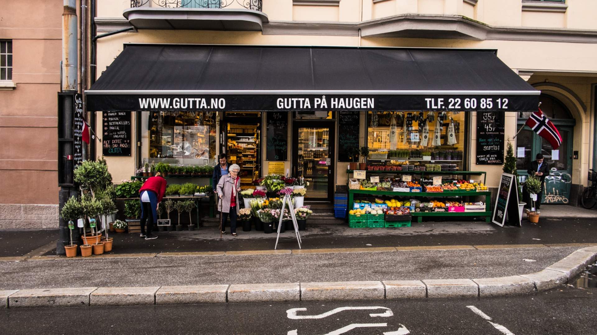
Gutta på Haugen is a specialty food shop in Oslo. It opened in 1994, runs several branches in the city, and ships nationally. Until this project its website was the form-and-telephone arrangement described in Part 1.
What follows is the eight-job inventory applied. Each block names the job, the problem, the interface built to carry it, and the reasoning. Evidence, where it exists, is labelled with its source — and where it does not exist, that is said plainly.
On the scope of this evidence. This section is design evidence, not outcome evidence. Kilowott does not have access to the client's analytics or advertising accounts, and no before/after performance figures for this project can be independently sourced. Rather than present unauditable numbers, this paper shows the reasoning and the built result, and says where proof is missing.
The product page absorbs the phone call
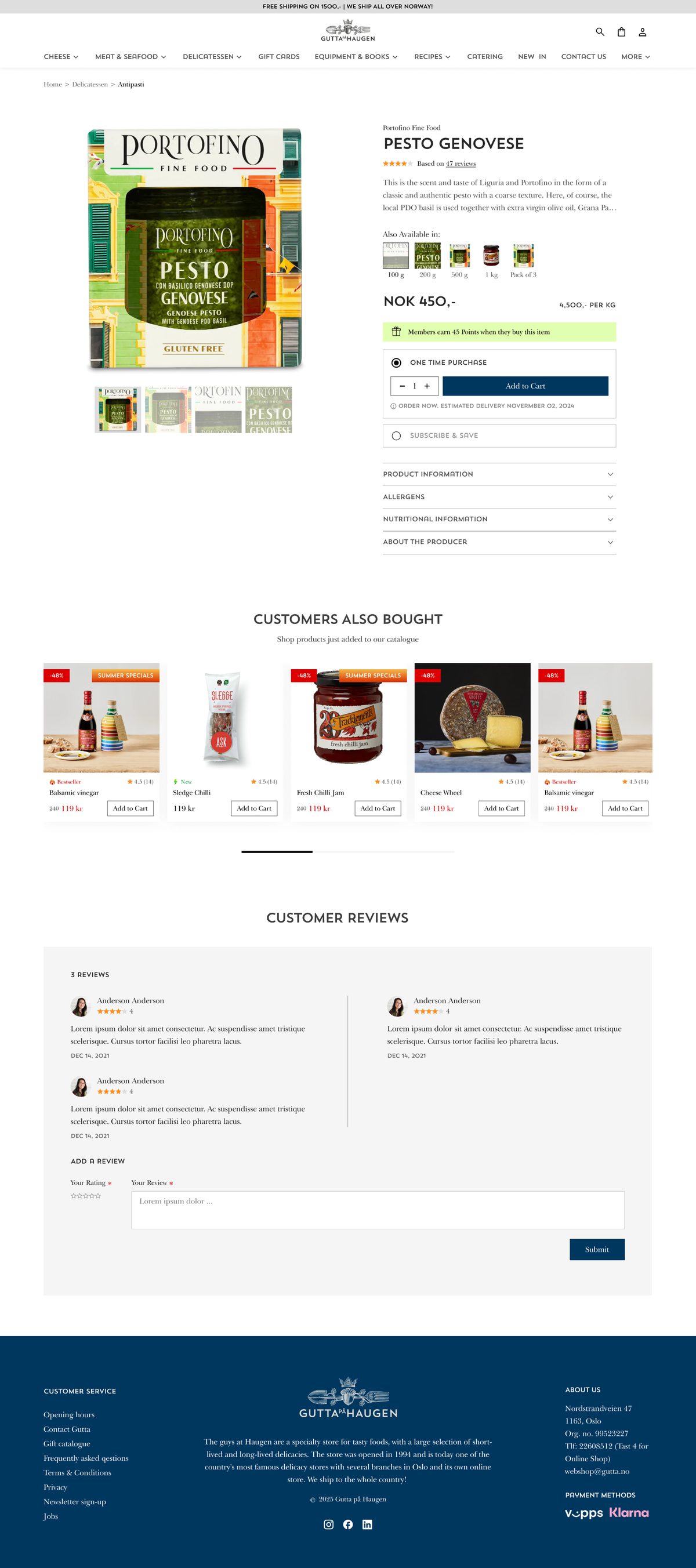
With the employee gone from the transaction, everything they answered live had to already be on the page: the producer, size options, a delivery estimate, ratings, and four panels covering product information, nutrition, the producer, and allergens.
The interesting part is the weighting. Asked what customers actually asked, the designer was specific — and it narrowed the problem usefully.
“Their shoppers were well informed. However offline most people would ask about allergens.”
Designer, Kilowott
So allergens earned a dedicated panel rather than being folded into nutrition. It was not, however, promoted to the buy area — a decision we return to in Part 5.
The recipe page becomes a storefront
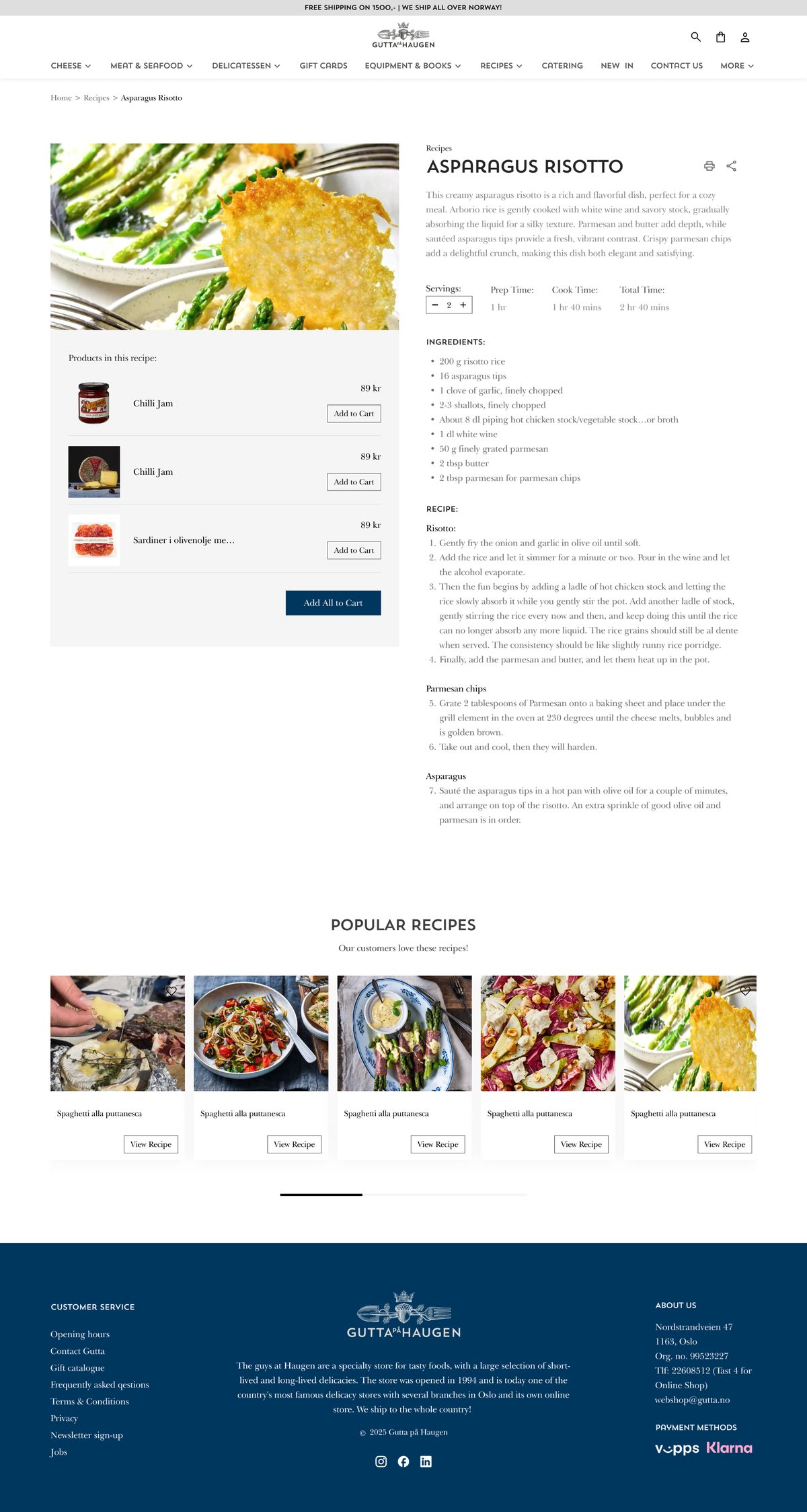
Gutta already had recipe content with an existing audience. It sat apart from the shop: read the method, then go and find the ingredients yourself. The redesign wires every ingredient to a real product card with its own Add to Cart, plus an add-everything action.
This was Kilowott's proposal, not a client request, and the argument was simple.
“They had an existing page for recipes. Knowing that users would buy the ingredients for the recipe, having the products there would increase basket size.”
Designer, Kilowott
Evidence. Client-reported only: the client "loved the idea" and says a lot of purchases come through that flow. No basket-size delta or attach rate was measured. Separately, third-party benchmarks for shoppable recipes indicate roughly a 30% lift in basket size and about three additional items per order[7][8] — that is market data, not Gutta's result.
Subscribe & Save, offered at the decision point
Part of the catalogue is staples — things a household rebuys monthly. Under the old model that meant repeating the entire form-and-phone-call loop every single month: the worst case of the manual process, suffered by the most loyal customers.
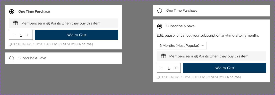
The buy area offers a one-time purchase or a subscription as a plain radio pair, directly above Add to Cart, with checkout splitting the total into what is due now and what recurs.
“Some items needed to be bought every month so instead of repeating the task the users can subscribe and as an incentive they would also get a discount. This also helps the shop lock in that customer for a long period.”
Designer, Kilowott
Note the order of that reasoning — removing the task first, discount second. It matches the finding that convenience, not price, is what subscribers say they value[9].
Evidence. None captured. No subscriber count or repeat-rate data available.
One balance across shop and web
This one arrived as a constraint rather than an idea. Gutta already sold physical gift cards across their Oslo branches, so a web store that could not honour them — or that issued cards the shops could not accept — would have split the brand in two.
“Client requirement, they already had physical gift cards.”
Designer, Kilowott
The cart accepts a discount code or a gift card through one field, and the gift-card flow offers in-store pickup or online purchase. The engineering consequence is the balance-synchronisation problem described in Part 3: a card must be spendable exactly once, from either channel, with both channels agreeing on what remains.
Evidence. None captured. The cross-channel integration work is documented as feasibility research and a technical roadmap; confirm what shipped before citing it.
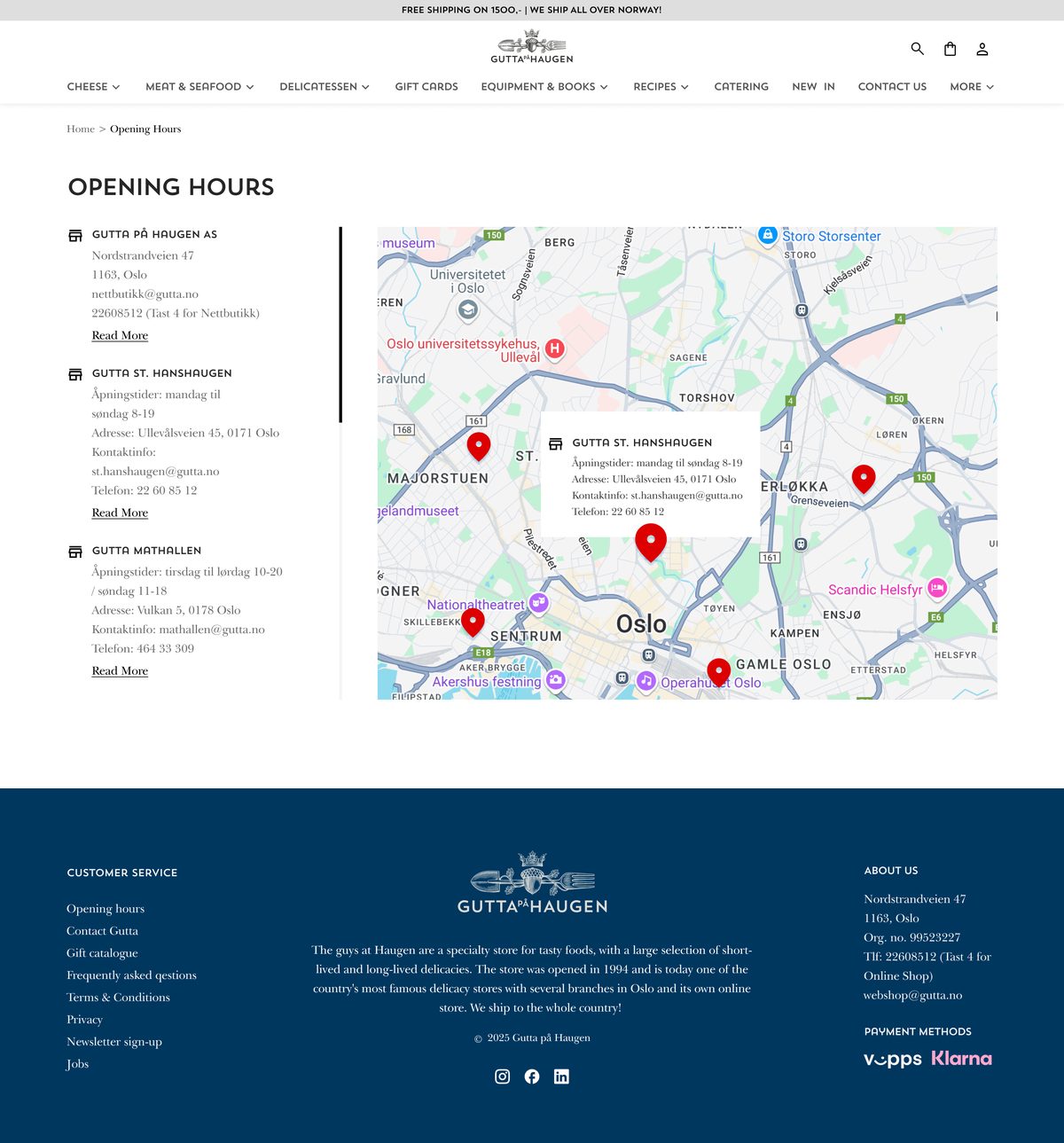
A store finder wearing the label “Opening Hours”
Several branches across Oslo means two questions, not one: which shop, and when is it open. Asked which of those customers struggled with, the designer's answer was both.
What was built shows hours and contact details per branch, an interactive map giving an overview of all locations, and a Google Maps handoff for navigation. It is the piece the designer named when asked what he was most proud of.
Worth noting as a lesson rather than a criticism: the page is titled — and linked — "Opening Hours," which describes one of the two jobs it performs. When an interface absorbs a job nobody wrote down, the label often lags behind the function.
Evidence. None captured.
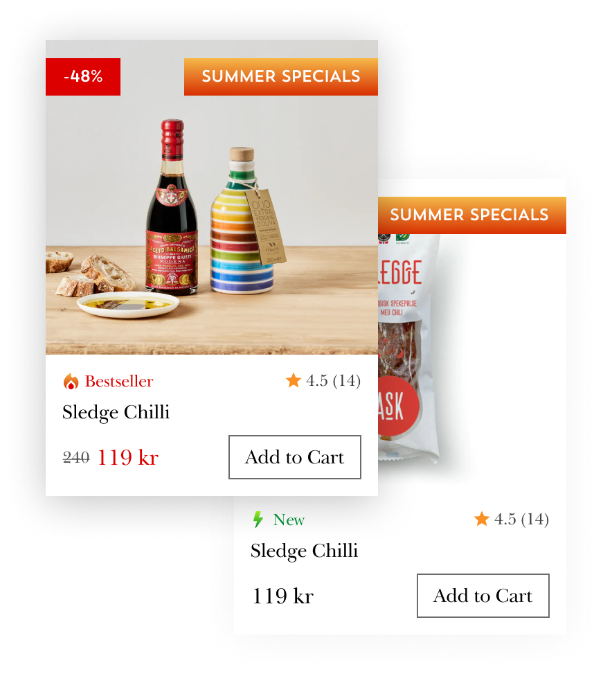
Urgency that only appears when it is true
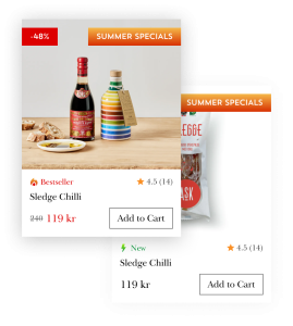
Here the method creates a genuine tension. A shopkeeper points out one thing that is good today. Conversion-optimised product cards point out everything at once — badges, flames, countdowns, struck-through prices — which is exactly the supermarket register a gourmet brand is trying not to occupy.
The resolution was to make the loud state conditional rather than default.
“The badges only show on discounted items, the rest stay clean.”
Designer, Kilowott
A normal category page therefore stays quiet and on-brand; the red discount badge, the bestseller mark and the low-stock line appear only where there is something genuinely true to announce. Conditional emphasis keeps its power precisely because it is not always on.
Evidence. None captured.
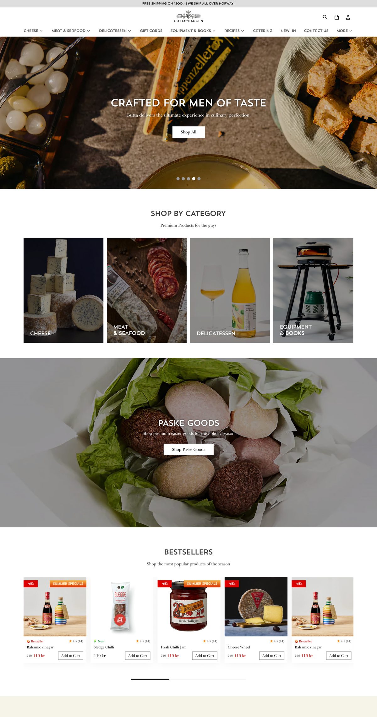
Restraint as positioning, not as taste
The old site had no design at all, which makes the obvious correction "make it look like a shop." Instead the landing page runs full-bleed food photography under a flat scrim, one uppercase heading with a single explanatory line per section, square-cornered monochrome buttons, and a great deal of empty space.
“Their brand focuses on gourmet products. Their customers also are mostly well to do or aspirational people. Being minimal ties in to Norway design style and also keeps it classy.”
Designer, Kilowott
Three arguments in one sentence — the product is premium, the customer is affluent or aspirational, and minimalism is the native Norwegian idiom. Density would have read as supermarket, undercutting the only thing the shop actually sells: judgement.
Evidence. None captured.
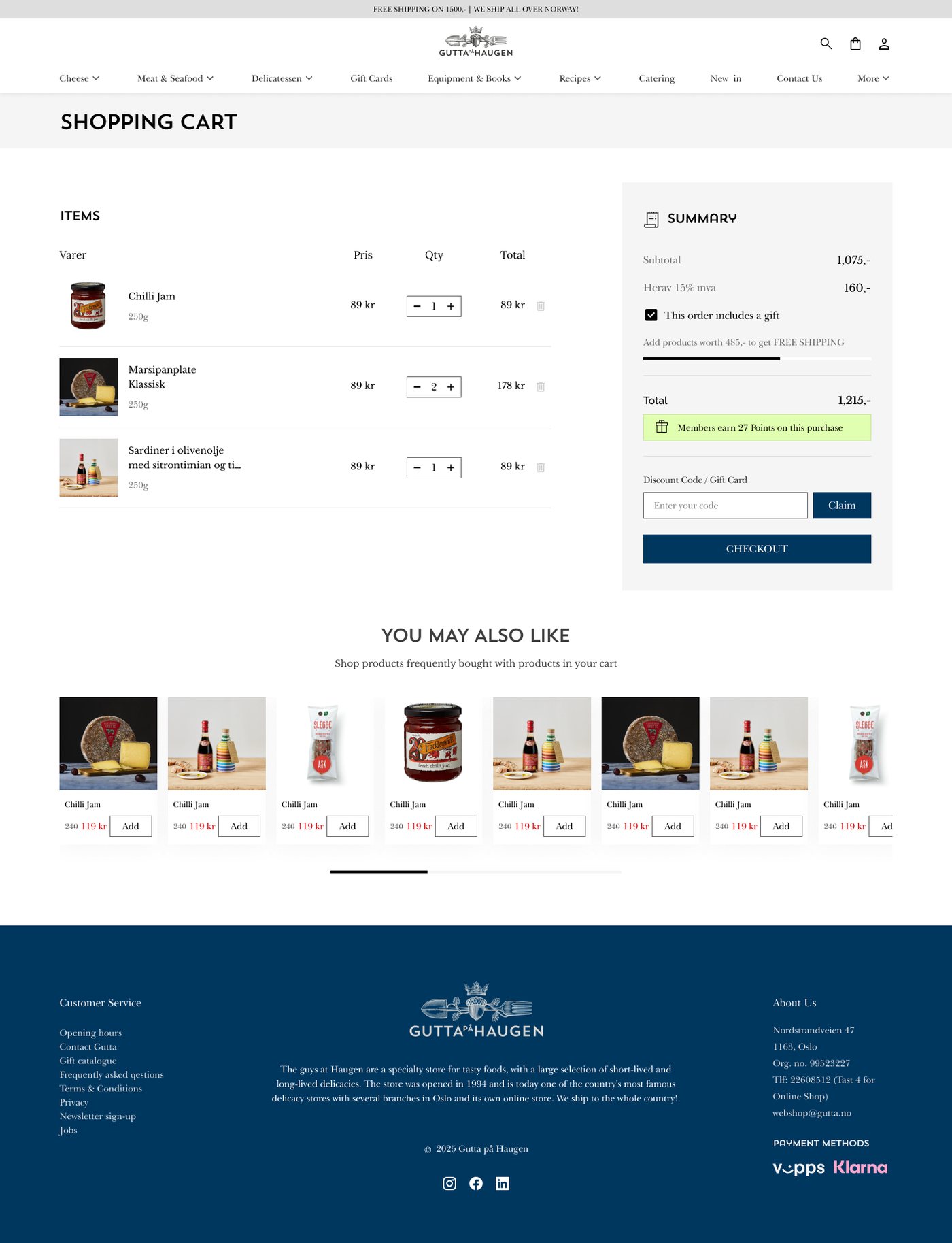
And finally, the part the platform actually gives you
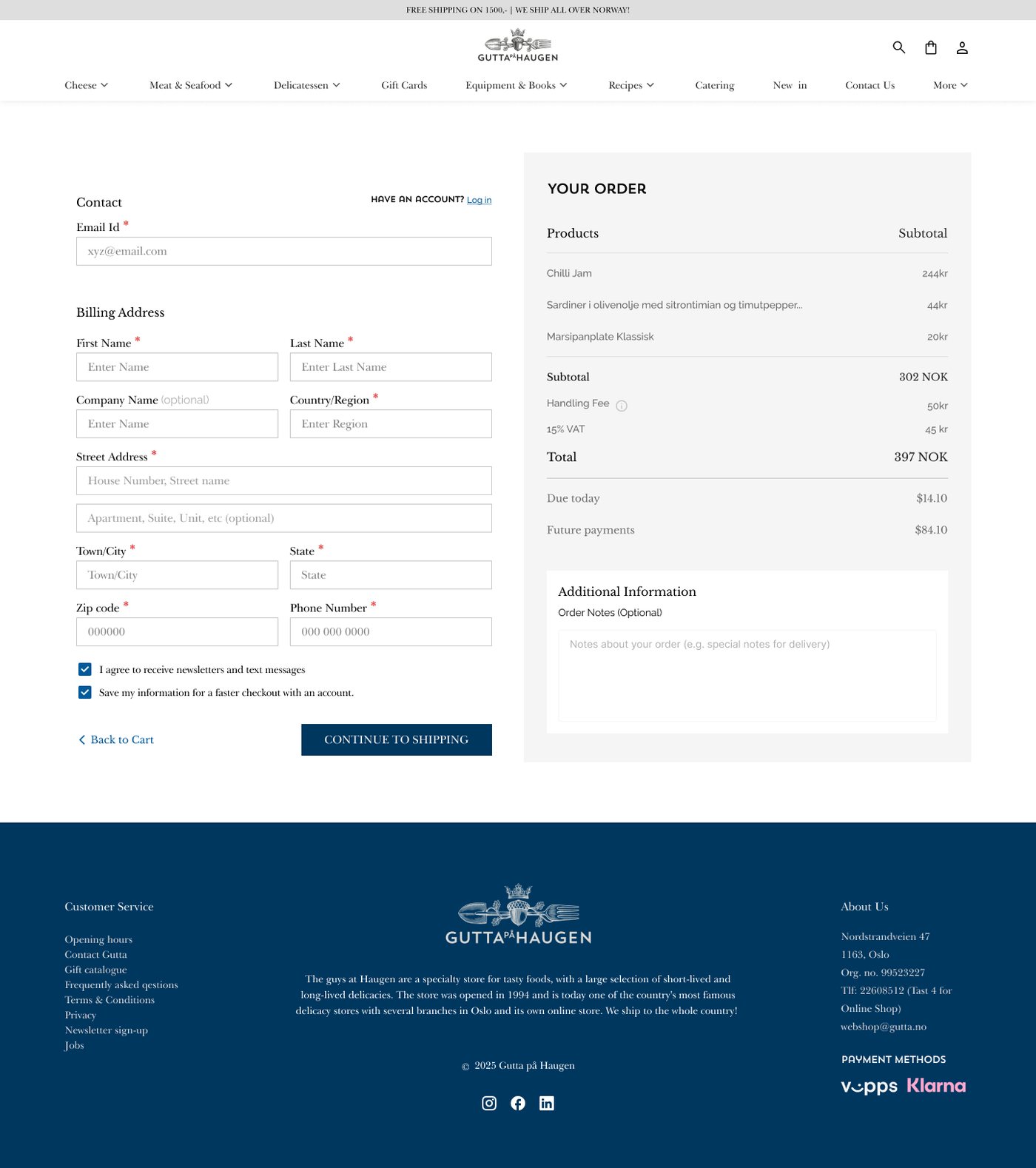
Checkout collects contact and billing details, offers login, states handling fee and VAT separately, carries an order-notes field for delivery instructions, and — because of Job 3 — splits the total into what is due today and what recurs.
This is the one job of the eight that a platform migration delivers more or less out of the box. It is also the one that gets all the attention in the brief. Asked which single decision mattered most across the whole project, the designer named it — but note how he framed it:
“Moving from phone orders to a proper WooCommerce store.”
Designer, Kilowott
Not "building a checkout." Moving from phone orders — the whole operating model, of which the other seven jobs are the substance.
Part five
What to take away
- Interview the people who answered the phone, before you write requirements. They hold the eight-job inventory in their heads and nobody has ever asked them for it. One sentence — "most people would ask about allergens" — can reorder a roadmap.
- Write the inventory down, then name an interface for each item. Any job without a named owner in the new design is a job that will silently stop happening.
- Attach merchandising to intent, not to the catalogue. Find the places where a customer has already declared a plan — a recipe, a gift occasion, a repeat order — and make those places buyable.
- Solve replenishment before acquisition. The standing order is the highest-value, least-contested revenue you have, and it is the customer the manual process punished most.
- Audit gift cards and stock early. If either already exists physically, you have an integration project, not a feature. Discover it in week two, not week twenty.
- Make urgency conditional. Emphasis that is always on is not emphasis. Reserve the loud state for when something is genuinely true.
- Instrument the old process before you switch it off. This is the one we would insist on next time — and the one this project got wrong. See both notes below.
What we would weight differently
Two things, stated plainly, because a paper that only reports its successes is not worth reading.
Allergen prominence. Allergens were the single thing customers reliably phoned up to ask. In the design they earned their own panel — but a collapsed one, fourth in a list, roughly a screen and a half below the buy button. Asked why it wasn't higher, the designer's answer was honest: "it was not extremely important."
The design meets the legal floor — the information is present on the product page before purchase, as Regulation 1169/2011 requires[1][2] — so this is not a compliance finding. It is a weighting question. When your own research surfaces exactly one recurring blocker, that is the strongest signal you will get about where to spend prominence, and the argument for treating it as ordinary catalogue metadata is weaker than it first appears.
No before-figure exists, and that is a real cost. Asked how many orders a day the phone process could handle, or what it consumed in staff time, the answer was: "I don't have insights on that." So the most compelling sentence this project could own — we replaced a process that cost X and capped throughput at Y — cannot be written, and will never be writable, because the old process is gone.
Spend one week measuring the thing you are about to replace. Orders per day, minutes per order, error and re-ship rate, how many enquiries never converted. It is the cheapest work in the project and the only work that becomes impossible later.
References
- European Commission, Distance Selling — Food information to consumers legislation. food.ec.europa.eu
- Regulation (EU) No 1169/2011, Article 14 — distance selling. legislation.gov.uk
- ECDB, Online Grocery Industry in Norway. ecdb.com
- Mordor Intelligence, Norway E-Commerce Market. mordorintelligence.com
- Go Autonomous, B2B Order Processing Cost — the number your CFO should be asking about in 2026. goautonomous.io
- LaceUp Solutions, B2B Self-Service Ordering. laceupsolutions.com
- Northfork, Enhancing the Online Grocery Experience: The Power of Shoppable Recipes. northfork.ai
- MikMak, From Screen to Table: Boost Grocery Sales with Shoppable Recipes. mikmak.com
- Swell, 40 Subscription Commerce Statistics for 2025. swell.is
- Opensend, Repeat Purchase Rate Statistics for eCommerce Stores. opensend.com
- Ginesys, The Gift Card Reconciliation Problem. ginesys.in
- Blackhawk Network, Integrating Gift Cards Across Platforms. blackhawknetwork.com
Designer quotations are verbatim from a structured interview conducted by Kilowott in August 2026. Screens are from the production design file. Market statistics are attributed above and are not this project's results. Where no evidence exists for a design outcome, this paper says so rather than estimating.