Sales and marketing should be less important with product-led growth because the product should be able to sell itself, right? Wrong.
Although a lot of the hard lifting in assisting the user in discovering value without human assistance is done by the product itself, product positioning and messaging become crucial during the user’s journey.
When users first learn about a product and are considering whether to sign up and try it out, this information is particularly important.
Product-led Growth To The Rescue
Marketers and product teams alike should be aiming to optimize for as many signups as possible with standout product-led growth visit-to-sign up rates hovering around 5%.
How can these teams succeed in doing this?.
Sadly, the best founders—highly technical professionals who have addressed a genuine problem they have personally faced in their work—are frequently less skilled in traditional messaging and positioning.
This can occasionally lead to endless agency meetings, many website updates, and internal organizational soul-searching.
Don’t panic! We’re here to help you with product-led growth.
What then should a founder do? Spend six figures of your hard-earned money on a marketing firm you don’t think would be beneficial? Website rebuilding (again)?
Wait a minute.
Kilowott activated the way back machine and looked into the alterations that a few exceptional product-led businesses made to their websites throughout time.
All of this is done to find out what works best. What is it that actually motivates users to join up for a product? How can entrepreneurs refine their messaging over time?
We conducted all of this study with the goal of assisting founders in launching themselves past typical traps and errors.
Related Reading: Digital Touchpoints Into Your Conversion Process: How We Do It
1. Messaging – Getting prospects excited about your offering
All messaging should be about your product since your website’s visitors are there to learn more about it, right?
Not quite. In the context of their demands, people like to learn about things. Think about describing your product in terms of how it will benefit them.
For instance:
While Mailchimp gets straight down to business with users’ need to convert emails into tangible cash, Typeform immediately addresses users’ complaints about “boring forms.”
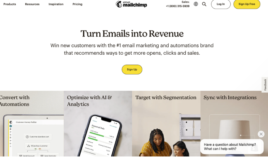
Additionally, you might have noticed that both of these websites are rather direct.
In school, we’re taught to formulate a hypothesis, come up with supporting evidence, consider the opposing viewpoint, and then circle around to support our position.
All of that won’t be acceptable to a digital audience.
Use a journalistic point of view while creating a website, opening with the punchline of why your product is important to your audience, and then elaborating the counterarguments after your main point has been delivered.
Finally, I found that many product-led growth SaaS firms employ customers’ fears of missing out (FOMO) to boost credibility and desirability across the website as a result of my research.
Customers’ logos may be displayed as FOMO for many firms, while enterprise-focused businesses may want to utilize something more like a Forrester Wave or Gartner Magic Quadrant.
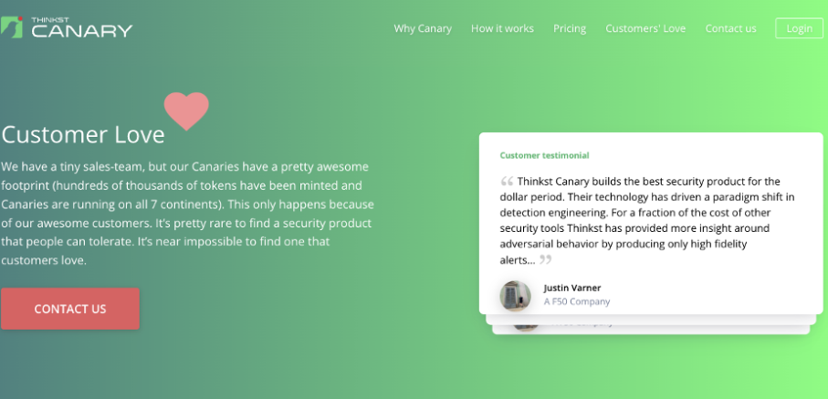
A few firms go one step farther by featuring usher love/like tweets, emails, and testimonials.
Thinkst Canary, which has a page of client compliments that is continually updated, is a popular example on the market right now.
No matter how you decide to set up your website, keep these key message results in mind and think about employing a marketer as soon as possible.
The strongest signup rates, even at scale, were seen in firms whose first GTM hire was a marketing specialist, according to data from our 2022 Product Benchmarks report.
This is probably due to the fact that these marketers are adept at handling things like positioning, determining the “jobs-to-be-done” of key user groups, and creating copy that persuades potential customers to join up.
It’s critical to choose carefully because ineffective rebranding has in the past caused problems for businesses.
Related Reading: Privacy-First Marketing For The Customer-Centric World
2. Design: App interfaces and more
Product websites typically have a highly challenging task because they have to transmit a lot of information while also making the company seem new, creative, and different.
Because of this, websites have started to resemble one another in recent years and have a lot of white backgrounds, sans-serif fonts, chatbots, and dropdown menus.
The number of website redesigns a business has carried out has advanced to the point where you can determine where they are in their fundraising cycle and marketing executive maturity.
It seems that websites could be a source of irritation for seasoned founders and executives.Keep in mind that show and tell isn’t just for young children.
Presenting a product with a gif, video, or other animation is currently very popular.
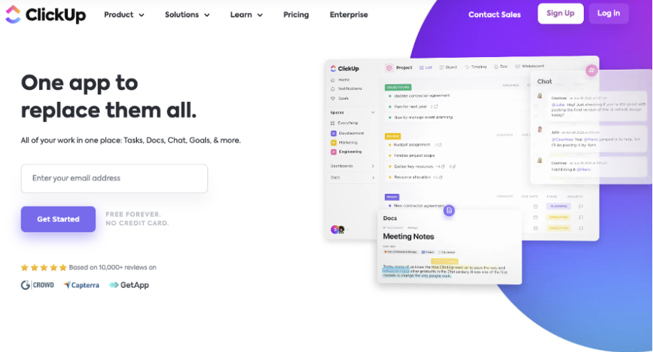
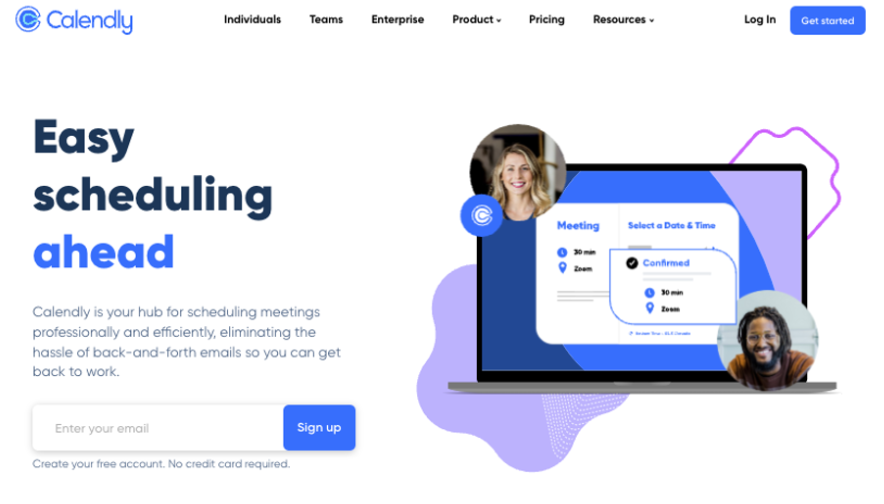
Calendly and ClickUp have similar user interfaces. They both enable users to get started directly from the website (resulting in an incredible web-to-signup rate), and more crucially, they both offer an animation of the product in action.
Another thing to keep in mind while thinking about websites’ messaging components is that potential users are individuals.
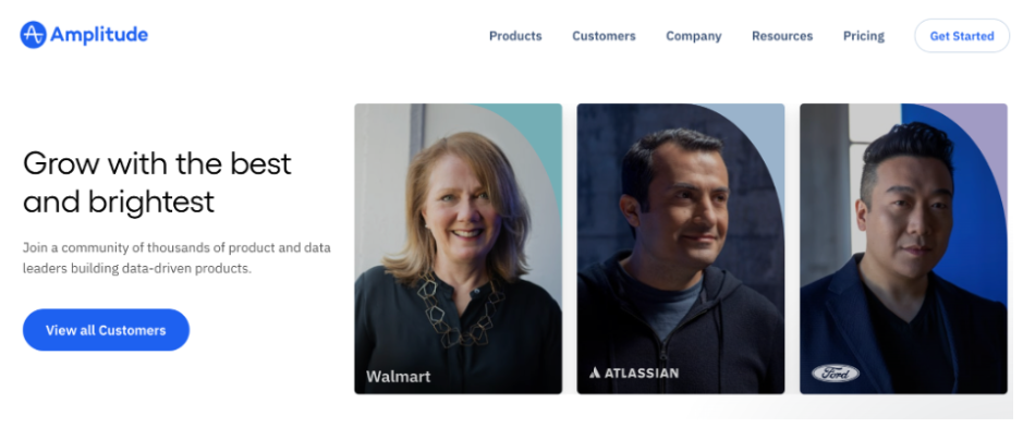
They want to know that other people are using your product, whether or not these users are aware of it (leading to FOMO).
Putting content on your website that visitors can see is one method to assist satisfy this irrational urge.
By presenting both the testimonials from aspirational brands and the real images of the customers who provided those testimonials, Kilowott manages to accomplish two goals at once.
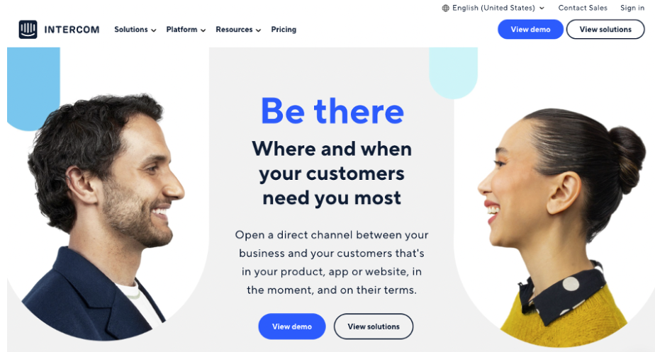
Intercom designs its website with the user in mind, which complements their messaging as an interaction platform.
Your team should experiment a lot with usability, colors, and fonts when it comes to design.
However, people are less likely to click that beautifully designed and thoroughly tested sign up button if they don’t grasp how your product visibly functions and how it applies to them.
Related Reading: Consumer And Audience Trends To Watch Out For in 2023
3. Deployment: Shipping and testing
Your positioning will seem to be constantly shifting as you learn more about your clients and start to see growth in your product. How do you know when to ship when your target is moving? Iterating and learning is the solution.
You don’t have to create an entirely new website that will launch in secret for six months. In actuality, you can and need to complete it in bits.
Think you comprehend the suffering of your customers? Create a new home page.
Want to increase conversion for a certain offer? Adapt your navigation.
To see the effects of these modifications, it’s important to start studies with a limited number of variables.
As you would with your product, keep an eye on your analytics and funnel to observe how updating your website affects them.
We are aware that redesigning a website might be intimidating, but don’t allow that to prevent you from achieving your objectives.
Building a website that speaks to prospective users is a slog, but don’t ignore it
The next time you review the layout of your website and the positioning of your goods, take a step back, take a big breath, and give it some serious thought.
Building a product that assists your firm in user acquisition, growth, and retention will lay the groundwork for a more resilient organization that can handle further user growth.
The majority of such burden typically rests with demand creation and product discoverability.
But be clear that your website will either become the bottleneck that turns your product into a big business or one that prevents it from doing well.
advertisements.
Related Reading: Which are the top performance marketing companies? Updated
Product-led growth conclusion
PLG websites convey the message that people come first, not features of products:
People are curious about how your product will improve their appearance. All that matters is that.
Excellent websites express their stories using an inverted pyramid: The most significant and pervasive line of copy that responds to the question “Why this?” must appear at the top.
The text following should allay frequent concerns and persuade skeptics.
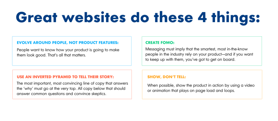
The messaging must convey that, in order to keep up with them, you must adopt their way of doing things if you want to remain knowledgeable and smart in your field.
Show, don’t tell: Use an animation or video that starts playing as soon as the website loads to demonstrate the product.
Concentrate on people: Using images of actual individuals helps prospective buyers visualize themselves using your goods.
And lastly, visit our website by clicking on the image below to find out how we deliver result-led and product-led growth via our plethora of digital marketing services.


